Overview
Lowe’s Corporate is the headquarters for Lowe’s. I was hired as a consultant to help improve the redesign Lowe’s iOS applications by incorporating the Dark Mode design
PRODUCED
2019-2019
CLIENT
SOFTWARE & SKILLS
CHALLENGE(S)
To migrate the current Lowe’s Light Mode iOS app to Dark Mode following strict WCAG 2.1 guidelines catering to those with visual impairment.
SOLUTION(S)
Fully migrated corporate branding to Dark Mode for iOS iPhone and iPad while adhering to strict WCAG 2.1 guidelines. This resulted in a clean experience suitable for users eyes as well as those with visual impairments. This also protected company from any potential ADA lawsuits.
PRODUCT TEAM
Stakeholders: 2
Scrum Master: 1
Product Managers: 1
Engineers: 2
Developers: 4
Product Designers: 1
UX METRIC(S)
NPS (Net Promoter Score)
Benchmarking
Heuristic Eval
Competitive Analysis
My Role
My role as a Senior Product Designer consultant was to re-architect the current flow of Lowe’s app and design the Dark Mode experience for iOS on iPhone and iPad. I also helped redesign the native app shopping cart experience for iOS but will not discuss in this case study.
Research
Research was already available however it took time in hunting down the both qualitative and quantitative data. Once found, I identified the four major uses which Lowe’s targeted and matched this with the current flows of the mobile applications.
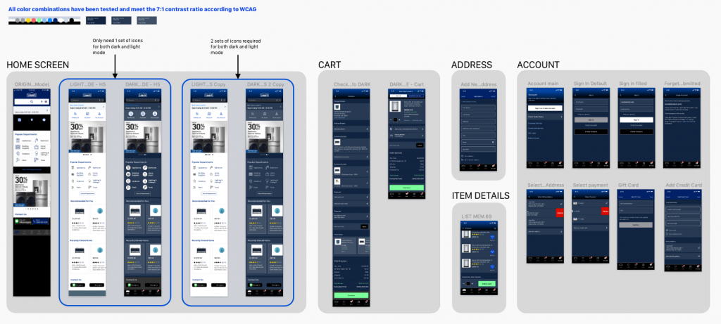
At the same time, I conducted accessibility testing with the Lowe’s branding to see which color pallet could closely match that of the WCAG 2.1 color ratio.
Information Architecture | User Flow
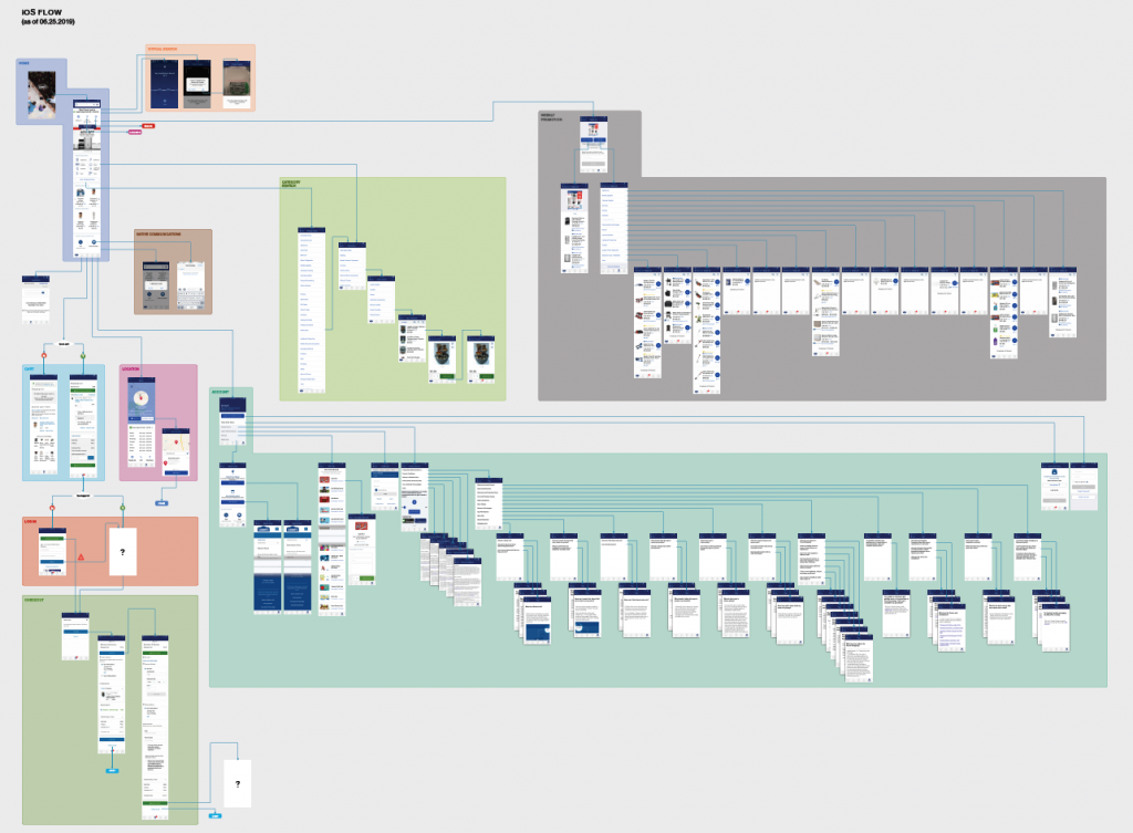
To gain more of an understanding of the current flows of the Lowe’s apps, I took screenshots of screens that existed in the iPad and iOS apps. I placed these screenshots in Omnigraffle and created the user flow that users navigated. The results showed several pages looped or dropped users off in dead-ends. I presented this finding to manager and devs to revisit and resolve these issues.

Design
While these issues were being resolved, I began conducting competitive analysis of other companies using the Dark Mode for their apps. Utilizing Sketch and Abstract, I created the style library to provide devs and other designers to utilize on current and future projects.


