Overview
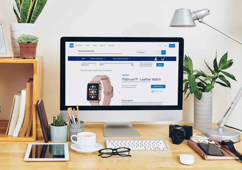
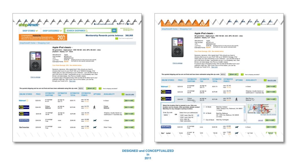
American Express and Best Buy collaborated on a service called “pick up from store” which allowed members to utilize their earned points to purchase products from Best Buy stores and picking them up in all of its stores nationwide. This was the first ever in-store pick-up experience integrated with American Express which started in 2011 for both mobile and desktop platforms.
PRODUCED
2011-2012
SOFTWARE & SKILLS
After almost 10 years, design has evolved however, the feature and interaction remains the same since I designed it for American Express. To view the interactions, you will need to have an American Express Membership account
CHALLENGE(S)
• Implement an experience where users can pick-up products purchased from the American Express Membership Rewards website using both AMEX card and points that users incurred while using their AMEX card(s).
• Design an experience where users can either pick-up or ship their purchased product purchased from Best Buy.
• Design a feature where users can modify their location to pick-up their product from Best Buy.
• As a mobile platform had yet to be created, I was tasked in designing this experience.
• Provide ambiguous business requirements that were provided in increments.
SOLUTION(S)
Designed an end-to-end experience for users buying products from Best Buy off of the American Express mobile and desktop platforms. While including such experience, I maintained American Express’s branding guidelines. No other interaction existed to resolve this feature and therefore introduced a new component (as if the page separated in the middle. Please see the designs below for more detail).
PRODUCT TEAM
Stakeholders: 6
Scrum Master: 0
Product Managers: 1
Engineers: 3
Developers: 3
Product Designers: 1
UX METRIC(S)
NPS (Net Promoter Score)
Benchmarking
Heuristic Eval
Competitive Analysis
My Role
My role as a UX Designer consultant was to design and end-to-end experience where users could either have their item purchased from Best Buy (in-store or shipped) on the American Express Membership Rewards mobile or desktop website. While awaiting reviews of design revisions, I was also tasked in designing interactive interstitial pages to entice users to buy products from American Express. I worked closely with engineers, developers, product manager and stakeholders.
Research
Analytics and usability studies were provided by American Express. We were unable to gain direct access to users. As this product began in 2011 and during this time, usability was not highly valued.
Information Architecture | User Flow
Integrating an interactive experience within American Express was very challenging. The business requirements were very minimal and end-goal was ambiguous. It was a very blunt and bland requirement to “empower users to purchase products from Best Buy on the American Express Membership Rewards website and allow users to either choose to have the product picked-up at a nearby Best Buy store or have it shipped to the user’s address on file (micro interaction).
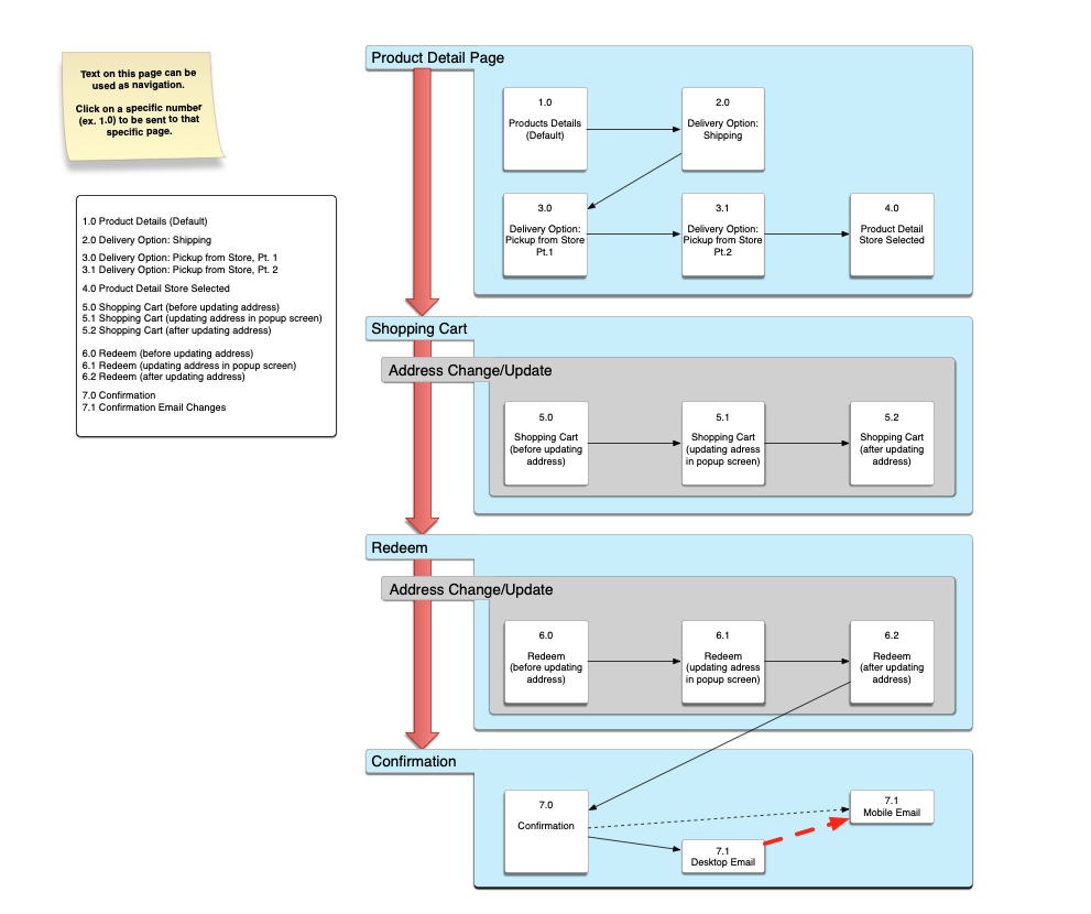
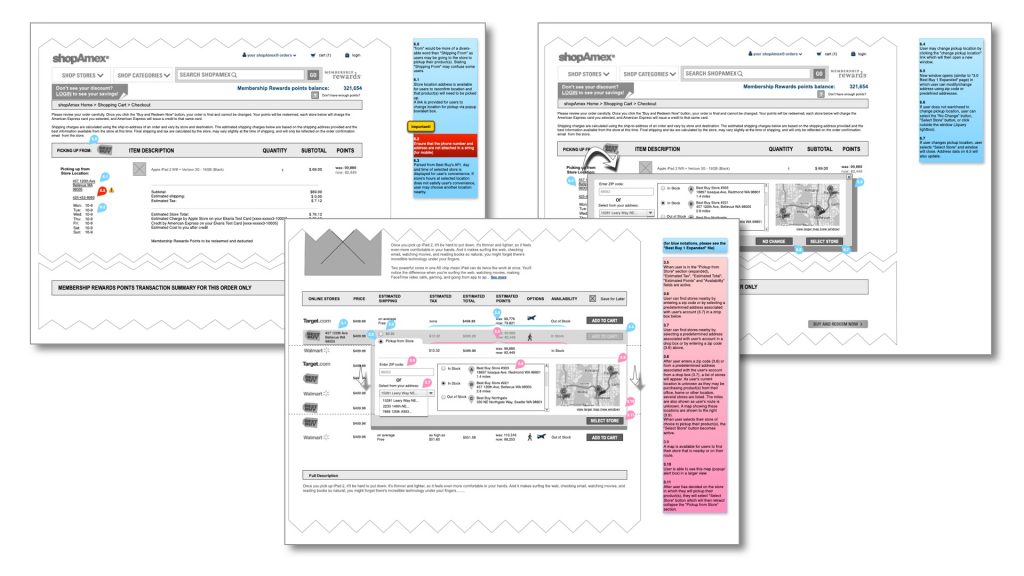
Desktop Design
With little information from AMEX, we had a deadline to reach which was January 1. Our team wanted to avail this product for American Express to launch before the holiday season, so we began to design and develop what we could with the little information that we were provided. If any information were to come from AMEX in the meantime, we could easily make the changes as we would have the framework in place. So with this goal, I proceeded with designing low-fidelity designs using Omnigraffle (this was in 2011 and before any other designing software existed).
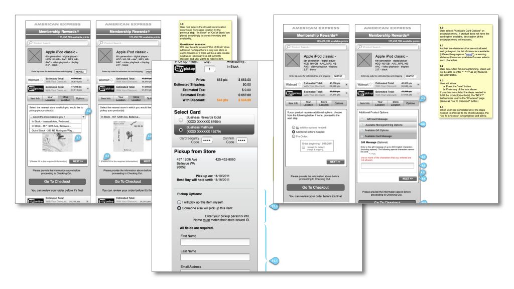
Mobile Design
Designing a mobile website was a bit challenging as I wanted to share the same desktop experience on mobile had limited components. Thankfully with my experience designing “iMode” websites in Japan paid off as well as working with talented engineers, the challenges were familiar. Determining which component to use for certain features required extensive research and conversations with developers to learn what was possible or not, given that mobile technology was in its infancy.
By balancing both the mobile and desktop experience, we were able to accomplish the release of the mobile application. Below are some of the low-fidelity design mockups:
The Results and Conclusions
The mid-fidelity designs were presented to AMEX headquarters for review and after a few iterations, the dev team became aware of what was expected to be developed. I provided the developers of the color pallet (I couldn’t find this in my hard-drive) and design mockups which they developed in rapid pace. By mid-November, we had finalized the mobile and desktop product. At the beginning of December, right when holiday shopping began its onward trend during the shopping season, the products were released and available to all American Express Members. I do not remember the exact number of user sessions and other analytic data after our launch but the traffic was phenomenal. When I arrived for work the day after the launch, we were very amazed with the traffic and how fast and how many purchases were made with our new product. By February of 2012, the data validated our goals.
10 Years Later...
To this day, American Express Membership Rewards service continues to use the same experience which the developers and I created since its first launch in 2011.
