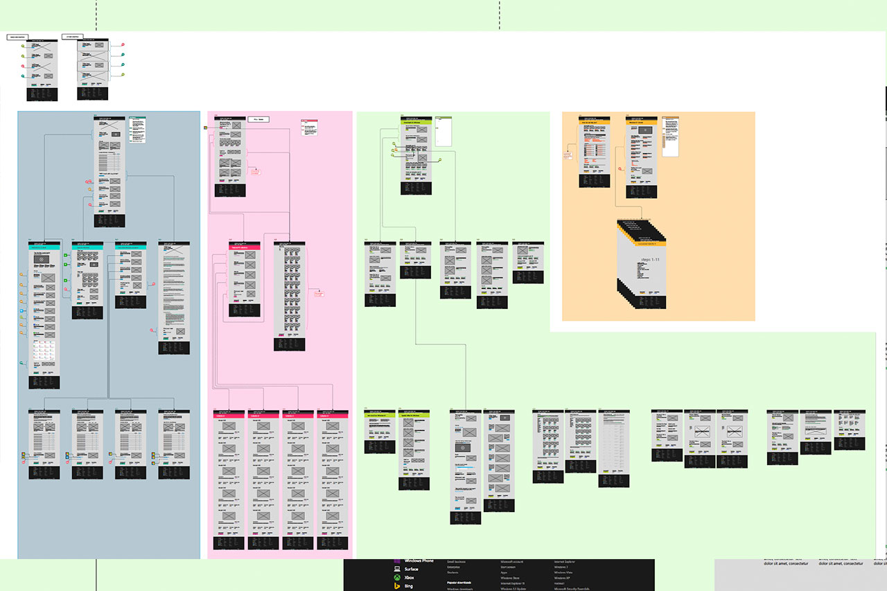
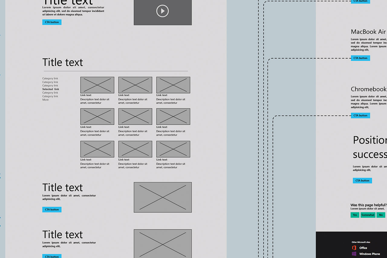
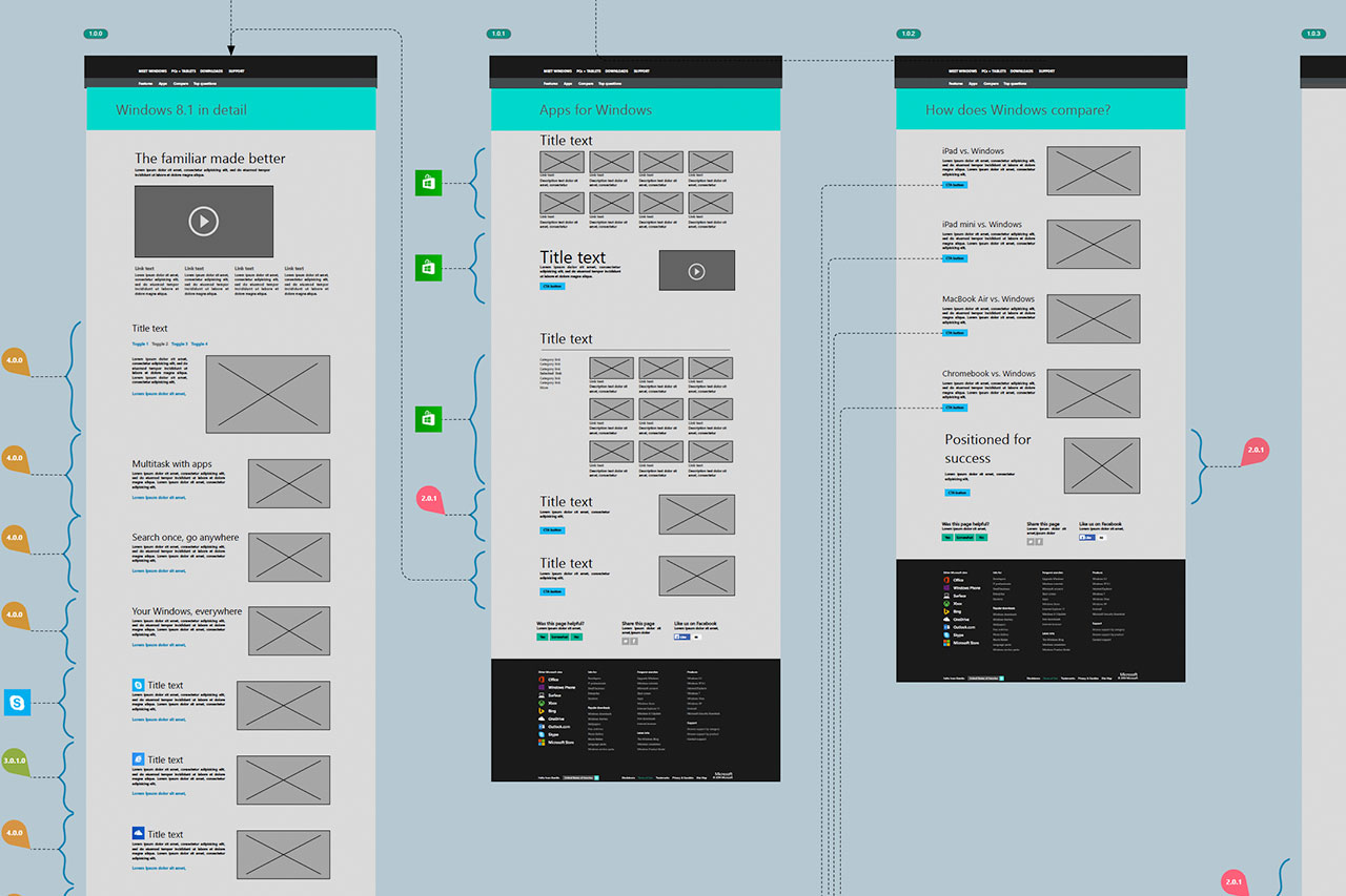
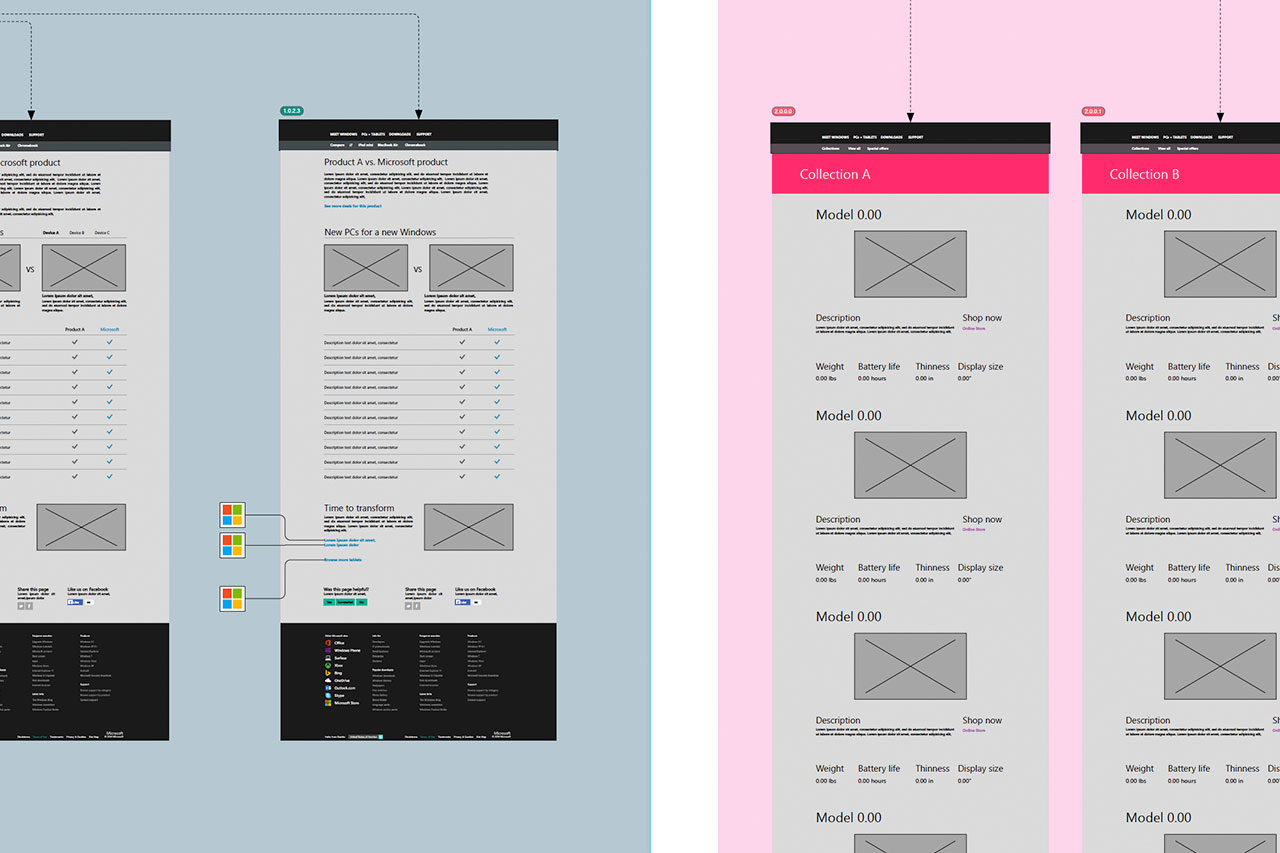
Windows App Store Information Architecture
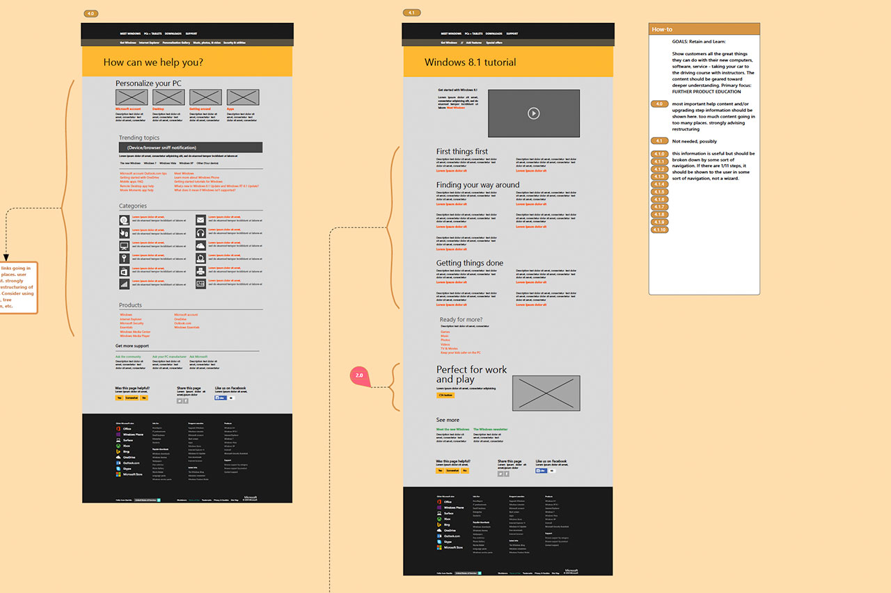
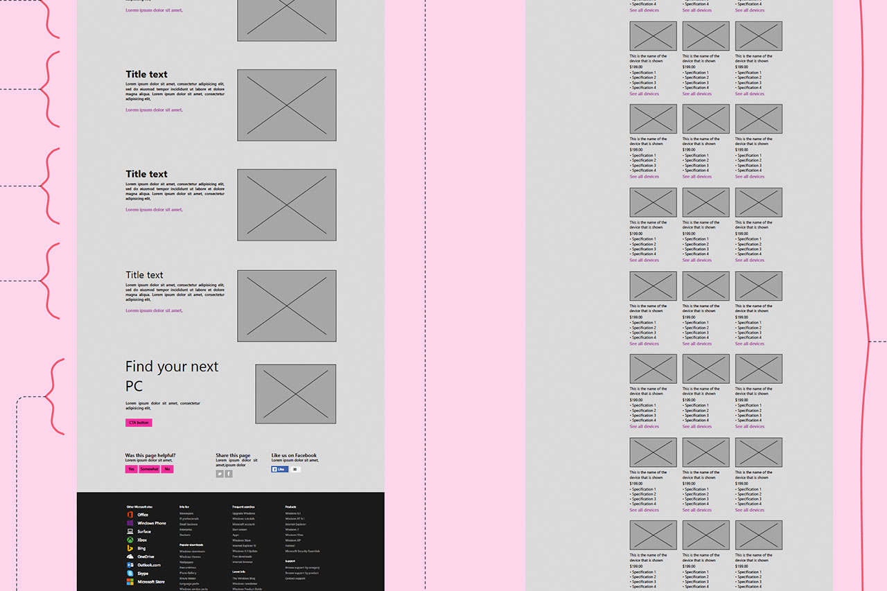
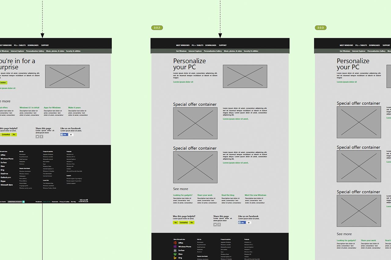
My task was to migrate a legacy site into a responsive site utilizing the Microsoft Design Guidelines.
This resulted in a cleaner, fast-loading site viewable through all devices. Beforehand, an analysis was conducted to determine consistent flows and limited clicks for users to perform. Afterwards, the app store was restructured based on user feedback, user research and business goals. This results in the current Windows app store that you currently see.
PRODUCED in 2014
Client: Microsoft
Category: UX Design/ Information Architecture / Microsoft


