UI DESIGN
- Credit Card
- Payment
- Checkout
Daily UI Challenge: #02 – Credit Card Checkout
Daily UI Challenge: #02 - Credit Card Checkout
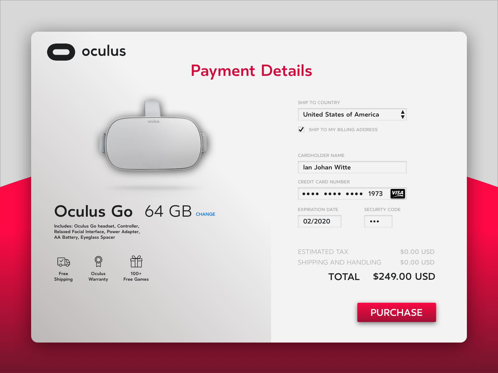
Finding the Oculus font (.woff) took longer than it did to design this. Well, almost as long since I was working on combining product and payment in one view. I decided to sway away from the typical “blue” action color and side with a hot-ass pink color to signal users of a final and crucial action.


