Overview
eBay Product Display Ads is an initiative to provide advertising space for companies and eBay sellers within the eBay ecosystem. Scheduled for a 2024 launch, this initiative aims to eliminate third-party affiliate partnerships, such as Google Ads. This strategic move will provide eBay with greater advantage, increased control over its operations and a notable boost in profitability.
CHALLENGE(S)
Design advertising space for eBay’s four retrofitted ad positions on four platforms. The ad design must be pleasent and align with eBay’s design system pallet. With limited real estate and business requirements made this especially challenging.
SOLUTION(S)
Created multiple versions for multiple reviews with team, stakeholders and users to find the best ascetically and functional ad designs across multiple platforms.
PRODUCT TEAM
Scrum Master: 1
Tech Product Managers: 1
Product Managers: 1
Engineers: 2
Developers: 2
Product Designers: 1
UX METRIC(S)
NPS (Net Promoter Score)
Benchmarking
Competitive Analysis
User Interviews
My Role
My first task was to conduct a competitive analysis to determine the best height on eBay’s mobile app and responsive desktop which resulted in 4 variationss from Walmart and Amazon. The heights
Research I - Competitive analysis
My first task was to conduct a competitive analysis to determine the best height on eBay’s mobile app and responsive desktop which resulted in four variations from Walmart and Amazon, among others. The heights which seemed consistent across eBay’s competitors were 242px and 390px for an iPhone 14/15 Pro viewport of 430px width. Though iPhone 14 was the most common device for existing users, we still needed to accommodate to the earlier versions of iPhone as well as existing Android users (320px).
Though there was enough real estate for the content which was required on a 430px width and was the majority of the market users’ devices, we cannot forget about the other users on the 320px width devices. This made it even more challenging.
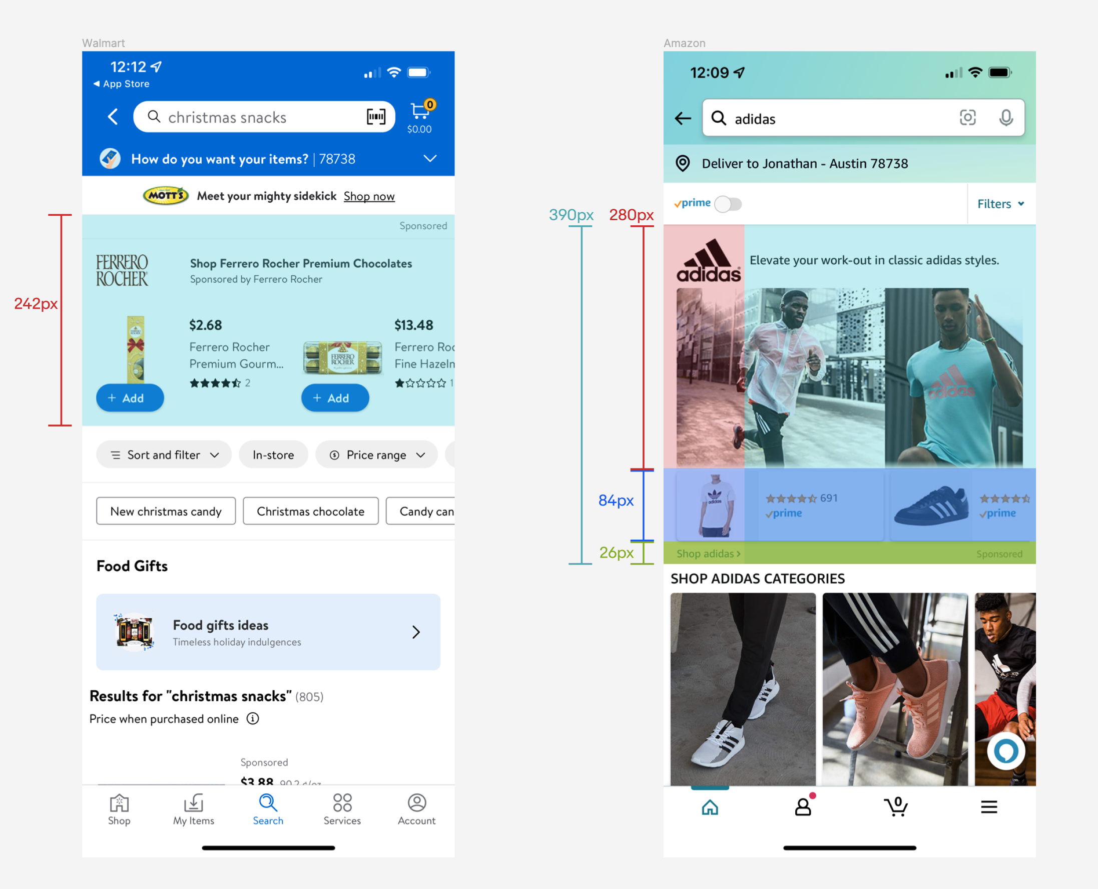
Two of the most common height of ads of eBay’s competitors
Research II - content strategy and Injection
Learning about our competitors and determining best height for the ad space, we now know how much real estate we will be working with. Keeping in mind with iOS and Android touch target guidelines, the grid system and content which are required for this ad space, was indeed a great challenge. The content which was asked to be placed into this ad were the following:
- Store name (12pt)
- Trust signal (12pt)
- Headline “Shop Store on eBay” (12pt)
- CTA “Shop now”
- Text reading “Sponsored” that directed users to DSA (11pt, legal size)
- store logo (12pt)
- Three images of products from the seller’s store (12pt)
The placement of these elements into a small ad space was similar to playing the game Tetris inside tea/coffee cup… I needed more real estate to allow the elements to be easily digestable by users and look esthetically pleasing…which it was not at this stage due to the content, CTA, three images and character count.
After negotiating with the product team and the legal advisor, I was able to reduce the text “Sponsored” from 12 pt font to 11 pt font. Though it is only a 1pt font size difference, this helped tremendously. Then I (respectively) pushed for more…. by providing additional versions showing this idea. Then I asked if we could combine the Headline “Shop Store on eBay” and the CTA “Shop Now”. This idea was faced with hesitation and reached all the way to the leadership, it was granted.
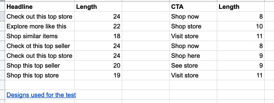
Determining the headline character count to prevent wrapping
Design
Now that I had what I needed to move forward with, it was time to get my headphones on and begin the design variation process. This process is basically creating various versions slightly similar to the previous, changing the shape and modifying the aspect ratio of images, altering words, increasing/decreasing fonts that helped balance the layout and moving content around. Once I had determined a few potential winning versions, I moved onto the desktop ad space. I thought this was quite easy as the same content was being used however, in a lot more minimalistic version due to the abundance of real estate I had to play with.
With the change requests I asked and was granted by leadership, the ad design layout still looked congested, crowded – it needed to breathe! By producing additional design variations, I came to the conclusion that three images, with the new changes to the content, still looked unpleasant. “Perhaps, if I create a mobile ad version with just one image in addition to the versions with three images, the team could see that one image was enough?”, I thought to myself and began creating a version of the ad space with just one image…and it looked beautiful!
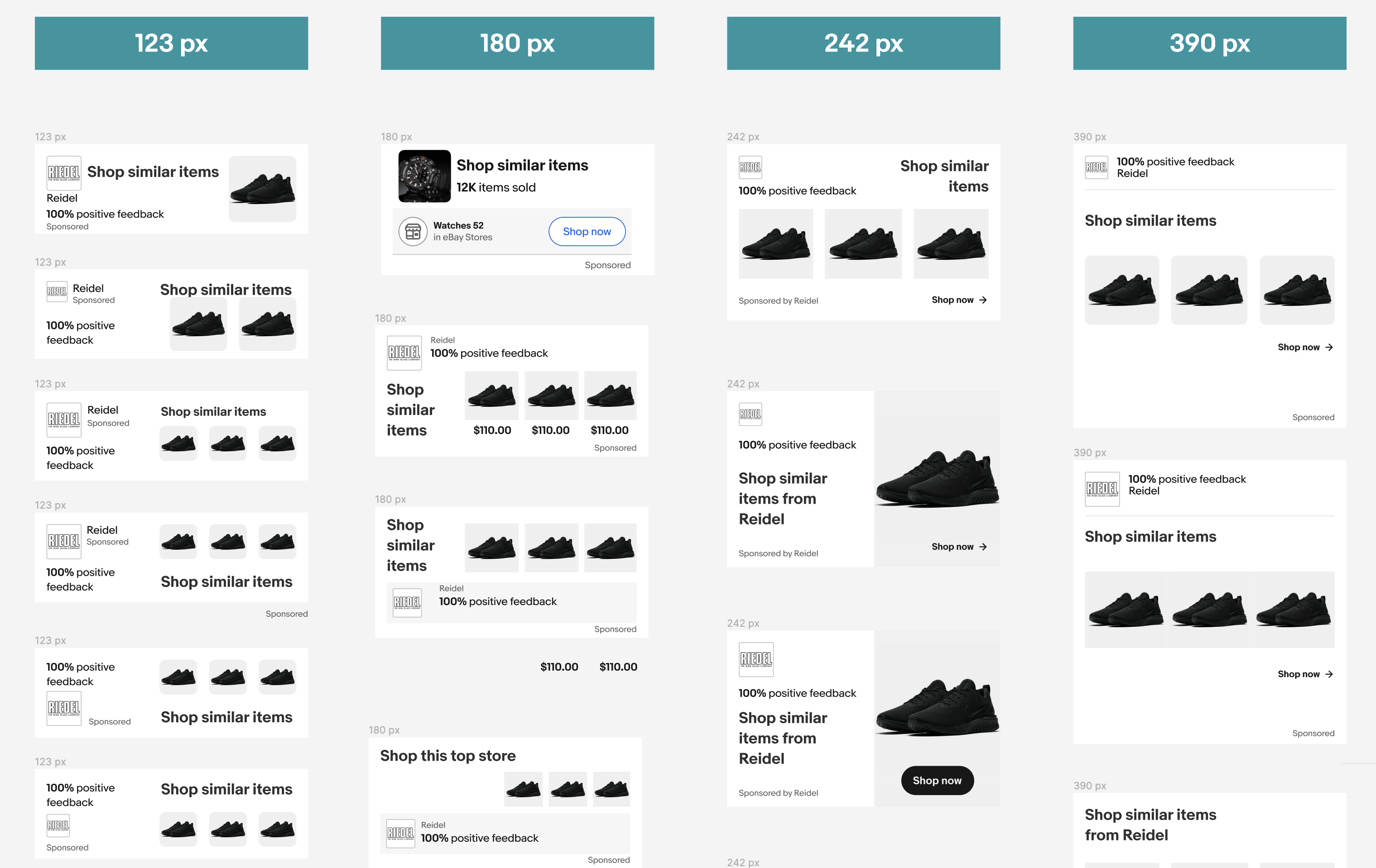
A few versions of the mobile ad space with one image versus the original three image.
With the recent understanding that we may not be able to fit all three product images into the mobile version of the ad space, I provided an alternative solution by rotating the three product images. I created a meeting with the product team and engineers to see if it was a workable solution that everyone could agree upon…and if not, open the floor to suggestions.
I provided the specs with the ad, all the content required on both the iPhone 8 and iPhone SE (yes, there was a quite a lot of users who still utilized the iPhone SE). Product and I were provided with some unfortunate news from the engineer that they only had the framework for a 124px height ad space. Fortunately, I had this already designed, as I usually do, for the worst-case scenarios. The whole team agreed that with all the restrictions, iOS guidelines, touch targets, DSA requirements, image ratio limitations, design esthetics and the approval from engineering that alternating images, was doable.
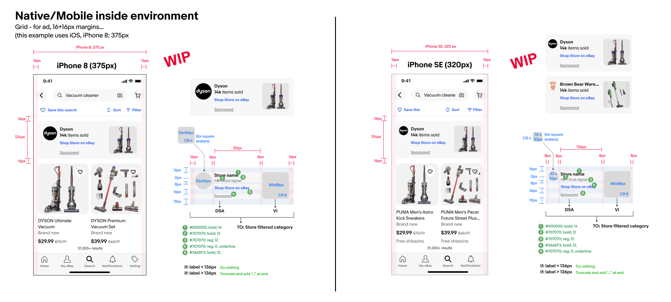
Specs of the eBay ad I proposed by showing a comparison with the smallest devices (iPhone 8 and iPhone SE)
Execute
With the obstacles out of the way and the answers that I needed to move forward with, I began creating iterations and variations with colors and placements in preparations for the Steering committee for both native app and responsive web.
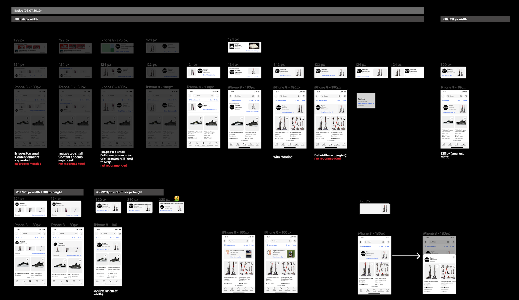
A few versions of the mobile ad space variations for testing
Testing approved many of the mobile versions which helped me validate the designs which worked well with users and the leadership. This eliminated additional versions to create and where I was able to take advantage of this time and cross-over to the responsive web versions.
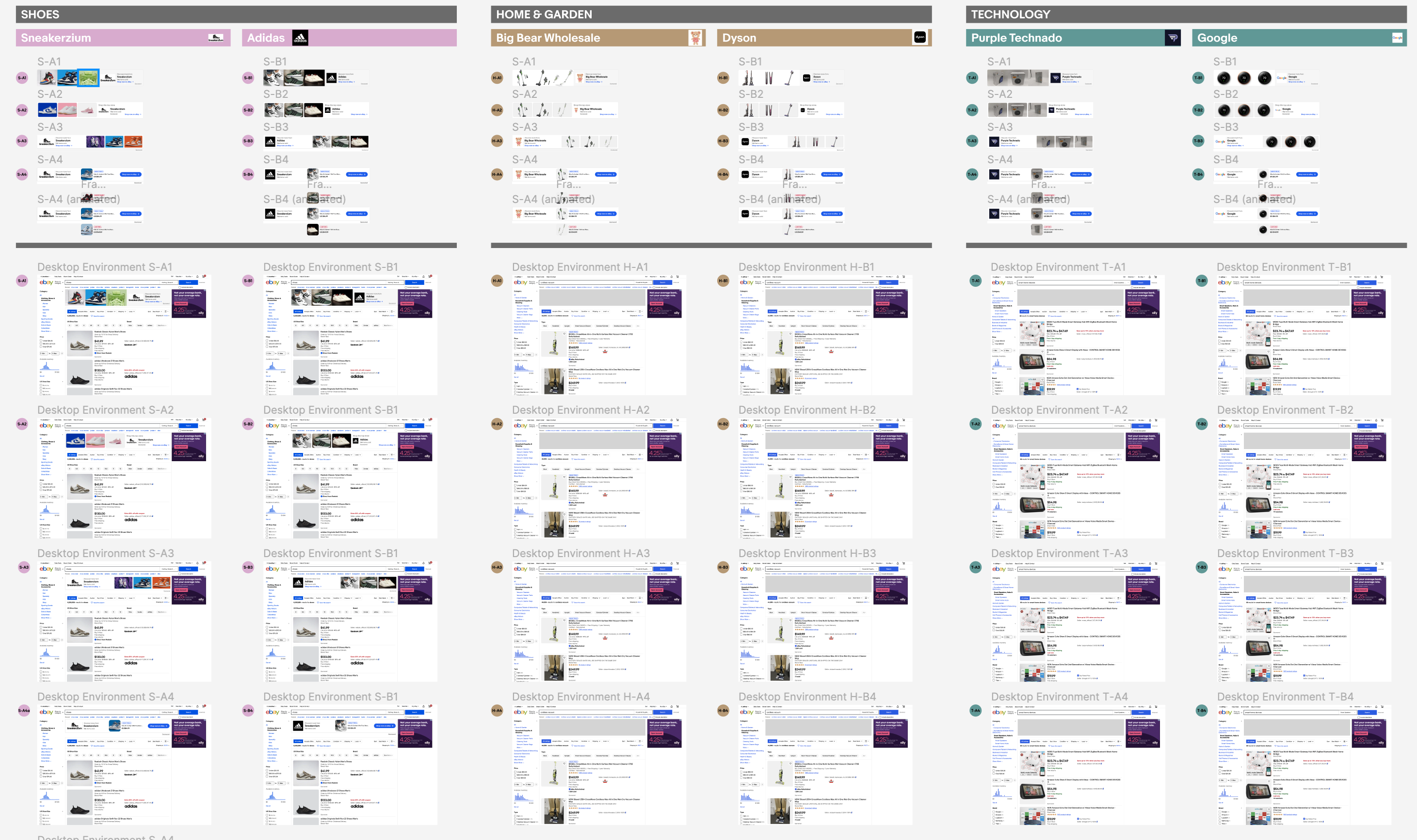
Variations of the responsive web ad designs. I used real world sellers on eBay in the ads and placed them on our existing websites to see how esthetic pleasing they would appear.
Deliver

Surveys after surveys, reviews after reviews and versions after versions, we finally came to the results of a design that worked perfectly well with everyone, including the users. There is still a lot of work to be done on the backend but the plan for the launch of this product is set for 2024.
I am happy to have played a role in this remarkable transition, moving away from dependence on third-party advertising companies. Instead, we’ve implemented a lucrative in-house feature that not only enhances visibility for our users and eBay but also empowers them with greater control. This harmonious shift signifies an amazing step forward for both users and eBay.

