- Virtual Reality
- Augmented Reality
- Mixed Reality
Very limited information was provided on how to design UI Menus for Virtual, Augmented and Mixed Reality for the average Product Designer. I have looked high and low for assets and templates in designing Mixed Reality apps but couldn’t find anything. With a few simple tricks using Sketch App and Photoshop, this can be accomplished. Of course we could open up the Unity software but for heaven’s sake, it costs money to buy the C# script and Mesh. Designers want to design sexiness, not indulge in development code to produce simple UI design mockups. Unsure if the menu and navigation which I made are in standards for Augmented and Virtual Reality guidelines, but I was able to replicate it. Until the guidelines become available, here are a few simple steps to make it happen 🙂

Design in Sketch App (or Photoshop...whichever you prefer)
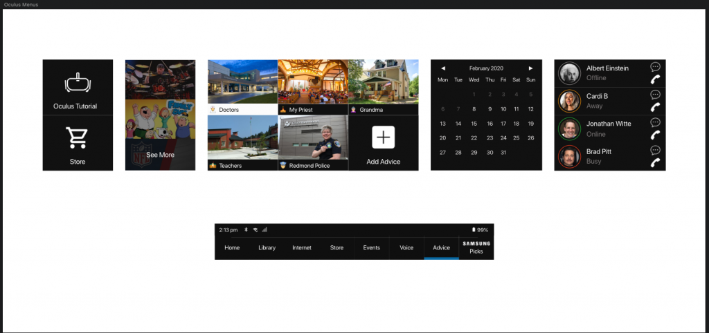
In Sketch App (or Photoshop), create your UI menu on a 2600×1200 artboard.

Export as .png to Photoshop
If you’re in Photoshop, then you are fine. But if you just exported from Sketch App into Photoshop, make sure that the Main UI is exported separately from the UI Navigation.

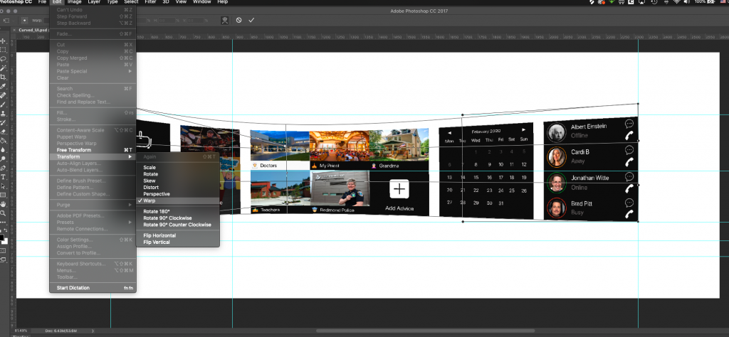
Transform and Warp!
This step takes some tweaking so go get a cup of coffee and take a breath.
- Import the two assets which you exported from Sketch App.
- Choose where your middle-point perspective will be. This could be exactly in the middle or off to the left or right. Mark it with the ruler tool. This perspective will be the most-narrow vertical point.
- Select either the Navigation or Menu asset.
- From the Photoshop navigation, select: EDIT > TRANSFORM > WARP.
- Select the points from the Warped corners and expand it, increasing the height slightly. Make sure the alignments are perfectly vertical.
- For the right-side of the asset, do the same as step #4 insuring that both the left and right-alignments are vertical.
- You will notice the edit-points of the Warp tool have moved. Depending on where your middle-point of your perspective is, you need to move these around
- Keep notice of the curvature; both the left and right alignment should have the same height however, the curvatures will be slightly different. If you can accomplish this abstractness, then you’re doing well. It also replicates that if it is actually in the VR/AR/MR environment, it will appear as if the user is slightly looking at the 2/5 position of the Menu. If you cannot accomplish this, don’t worry – just evenly curve it. I advise trying your best to practive with this Warp tool.

Export in .PNG back to Sketch App
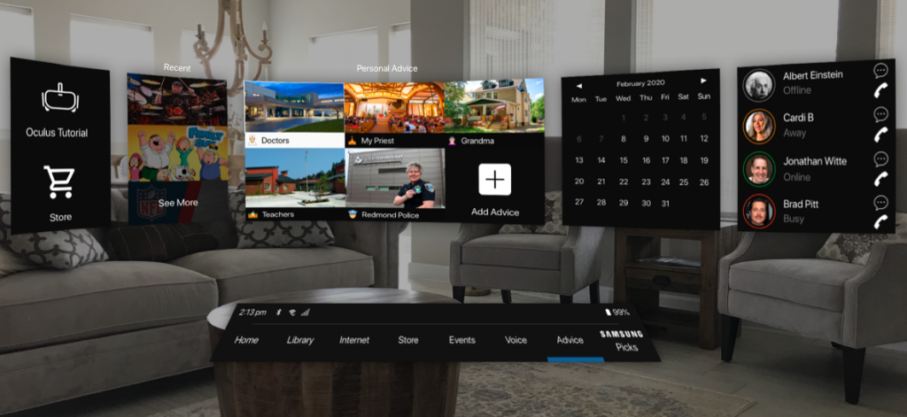
Do a little maneuvering to fit in your new concave menu and navigation onto a background image. You can use virtual reality backgrounds or your own personal background. I used my livingroom for my Mixed Reality. Don’t forget to add a little shadowing and decrease opacity on your background on a Black-colored mask object.
And there you have it! A menu and navigation UI catering to Augmented, Virtual and Mixed Reality environment!

