Rakuten Auction
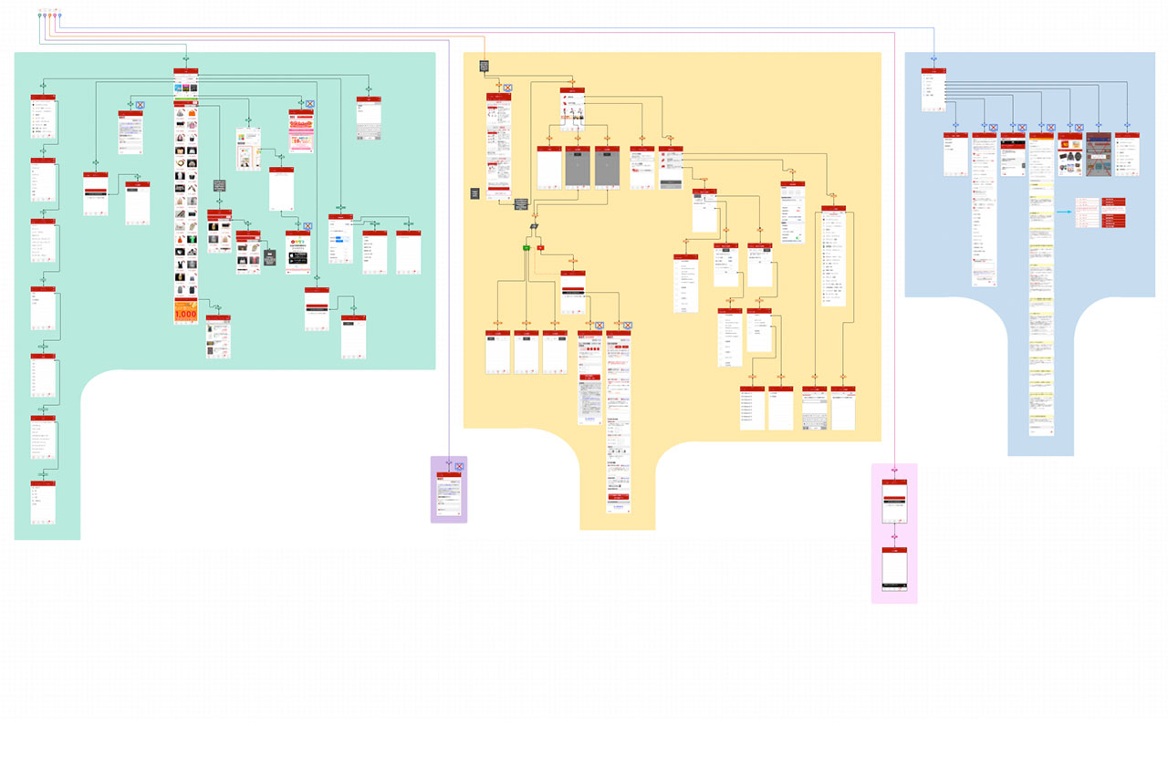
One of the strongest international competitors in the ECommerce market to Amazon is Rakuten. I was hired to work overseas at their Tokyo headquarters as a Senior UX Design Architect with their Mobile Department resolving complex architectural flows and providing guidance for features. Took part in research and usability.
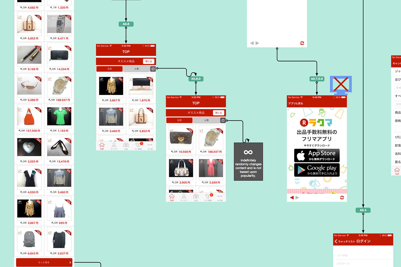
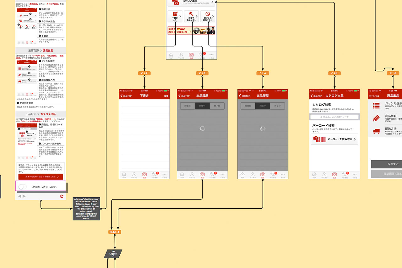
My task was to reorganized the Rakuten Auction app. After an analysis, I uncovered a lot of rouge pages, loop-backs, empty states that led nowhere and line-flows crossing. My professional rule-of-thumb when conducting analysis and creating information architectural flows is to NOT have any lines cross in a flow (line-flows). The flow shows how users enter an experience and exit with a performed task(s). If lines cross, the user flow will also cross and confuse users – trapping, frustrating and losing user engagement.
Due to tight legal, local regulations and overhead costs to continue this product, it was subsequently removed from the app stores and combined its service with Rakuten Rakuma
Produced: 2015-2016
Client: Rakuten Inc (Tokyo, Japan)
Category:
Product Design / UX Design / Information Architecture / Rakuten


