Overview
One of the strongest international competitors in the e-Commerce market to Amazon is Rakuten. I was hired to work overseas at their Tokyo headquarters as a Senior UX Design Architect with their Mobile Department resolving complex architectural flows and providing guidance for features. Took part in research and usability.
In recent years, Rakuten has made a global advancement with some of their apps such as Viber, Kobo, Viki and Linkshare.
PRODUCED
2015-2016
CLIENT
SOFTWARE & SKILLS
CHALLENGE(S)
• Conduct heuristic evaluation of existing Rakuten native Android and iOS apps
• Conduct competitive analysis of popular apps which use an array of navigation interaction patterns
• Create a matrix of distinguishments of existing Rakuten app headers
• Synthesize results and sort navigation in groups
• Create a consistent header which can be used across 32 apps while adhering to Rakuten and department branding guidelines
• Include a discovery feature where products can promote and cross-pollenate within the Rakuten ecosystem
• Design a backend system where departments could promote dependent upon season, launch of new products and to give low-traffic apps an additional push
SOLUTION(S)
Conceptualized and designed overall system, navigation, header for consumer-facing design and backend system for marketing teams to manage. Negotiated, pitched POC and promoted new feature for all of Rakuten’s native Android and iOS apps to departments so that all products could cross-pollenate through Rakuten’s ecosystem. Conducted extensive research, organized existing interaction designs and created a Global Header design system to assist in the reinforcement of Rakuten’s branding worldwide.
PRODUCT TEAM
Stakeholders: 2
Scrum Master: 0
Product Managers: 1
Engineers: 2
Developers: 2
Product Designers: 1
UX METRIC(S)
A/B testing
Benchmarking
Heuristic Eval
Competitive Analysis
My Role
Rakuten is divided in departments where they each led branding to their discretion. This resulted in a variety of branding (color pallets, icons, interactions, icons, etc). A direct initiative given by the CEO, Hiroshi Mikitani, requested that all products encompass the Rakuten Branding guidelines. By user data previously conducted validated this need. Users were confused and unsure about what Rakuten products were and weren’t. This made the user feel that they could not trust Rakuten, resulting in slowing purchases.
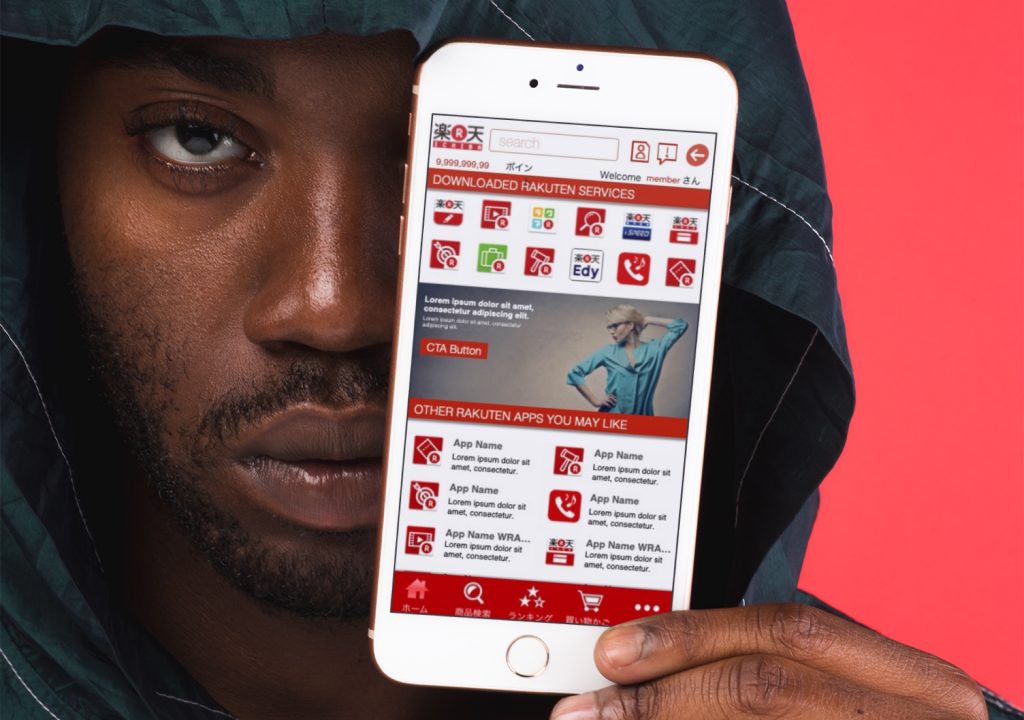
My task was to create a consistent header that all 36 Rakuten apps would adopt to enhance the Rakuten Branding. Our team was guided by one of the world’s famous designers “Kashiwa Soto” who also designed for Uniqlo, 7-11, Honda, Docomo, Microsoft Office for Mac, DoCoMo, etc. Kashiwa Soto also gave us the “thumbs up” with our designs which results in the images to the left. I provided UX and design chops to our other designers to create the Rakuten Global Header.
Research
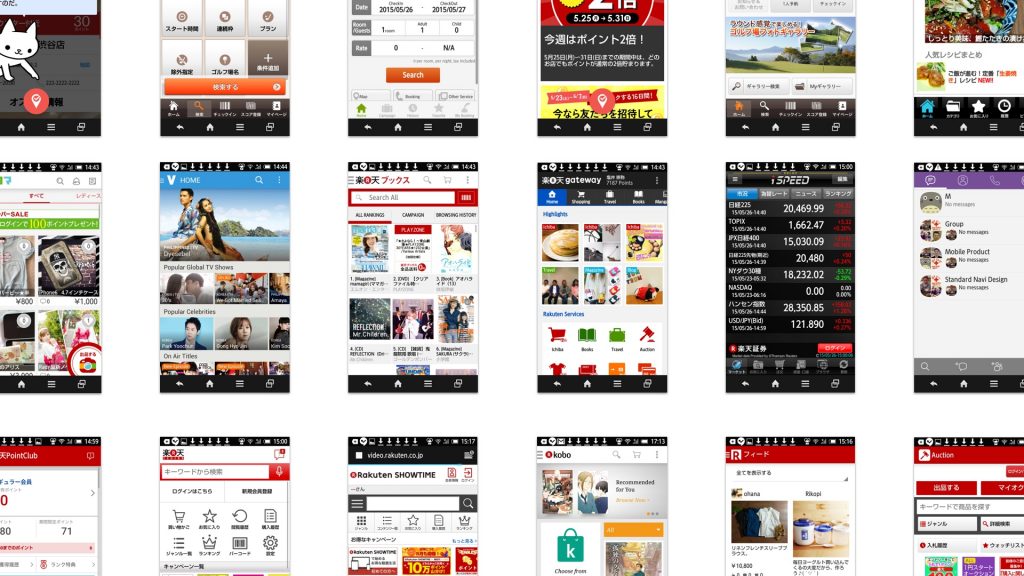
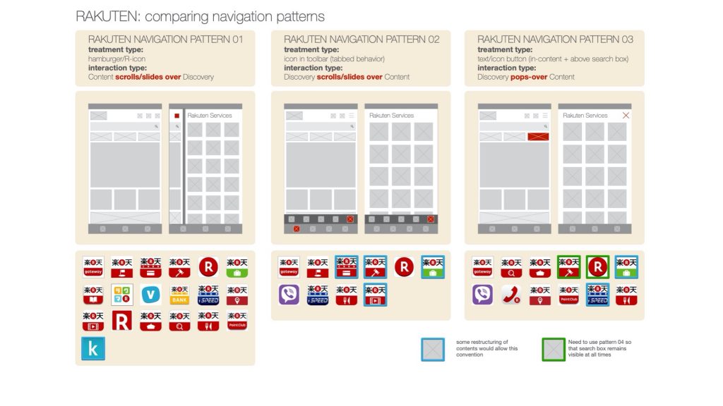
With the data I was provided from the research team, I began to breakdown, sort and organize existing apps that all utilized different interaction patterns, menus, navigation, branding color and two different operating systems. Gathering both an Android and iOS device, I began taking screenshots and noting their behaviors on an excel sheet. Using Omnigraffle (my favorite software for organizing) and grouped all into three separate groups; 1. In-content navigation, 2. Drawer navigation and 3. Bottom Menu navigation.
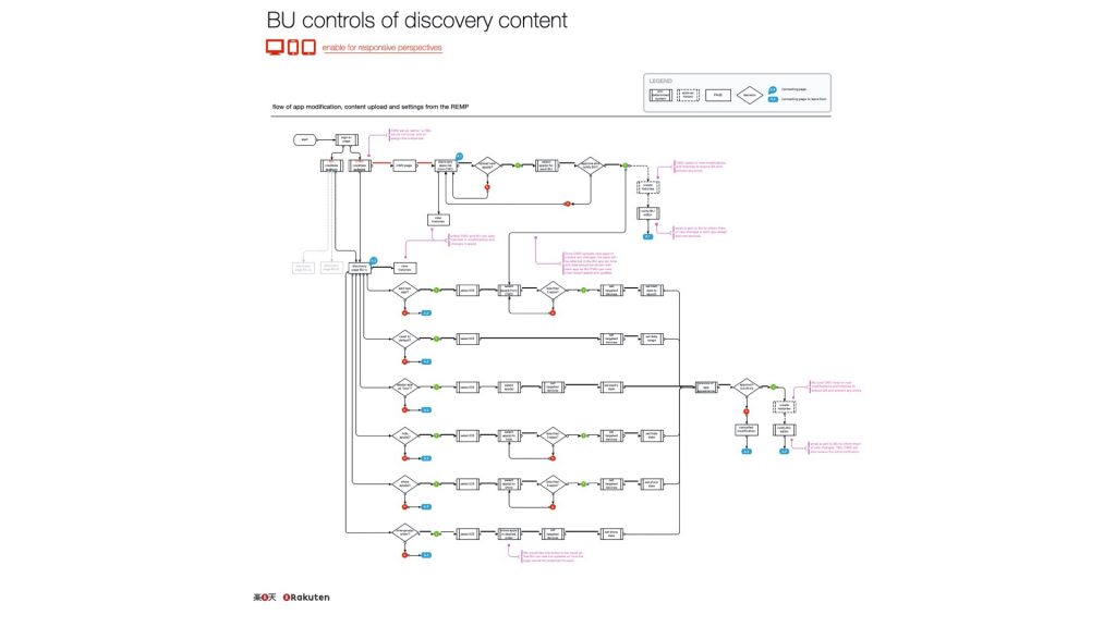
Information Architecture | User Flow
Alongside the Global Navigation, another project was introduced named “Discovery” where users can view other apps within Rakuten’s ecosystem. With the abundance of products which Rakuten owned, the priority of which app gets listed at the top (above the fold), was a new challenge. It’s quite simple to place all of the app links onto the Discovery page of every app, but a backend system was required to be implemented. Roles needed to be determined and created in order to manage and govern which app is placed per priority. For the sake in keeping this project simple, I have left out certain designs except for this framework which depicts those governors from each department who would need to communicate with each other and promote depending upon results of their discussions. But as this feature was being developed in unison with the Global Navigation, I provided the backend user experience.
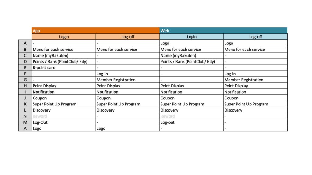
Synthesize and Sorting Interaction Patterns
As ALL of the Rakuten apps used icons in the headers differently (different order, design, color, user logged in, logged out, etc), I sorted them out on a list to gain an understanding of which is most commonly used by the most frequently used apps by user traffic.
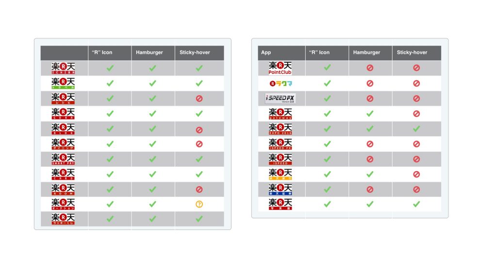
After researching the most common navigation interaction pattern while conducting my competitive analysis, I found that there were three most commonly used navigation patterns (drawer, in-content and bottom menu). From this, I grouped the most utilized Rakuten apps which used each of these navigations closely.
Creating Concepts
With Kashiwa Sato’s approval with the new header designs, I then moved to Sketch and began sketching some concepts of what the app “could look like” for a POC (proof of concept) for departments to inform them that the new branding ecosystem initiated by the CEO was underway.
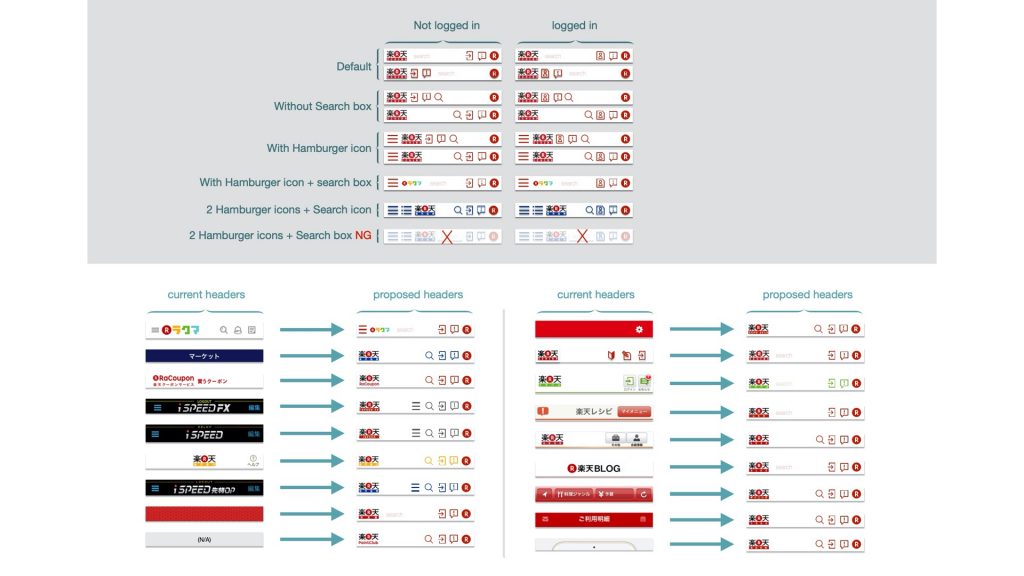
In Conclusion
There was a lot of pushback so I needed to provide several concepts and designs which catered to each product department. I also shared what other department’s new header design system was and shared insight on how cross-pollenating (with consistent branding identity) could assist every department. Some departments were excited and adopted the new designs however, the other departments remained reluctant to move forward for various reasons. With a smile on my face and empathy for their position, I provided them with the designs and my availability to assist in their needs.
